It’s the refrain of every introduction to creative writing seminar. It explains why Batman v. Superman: Dawn of Justice was terrible (well, it, and pretty much every other aspect of the film ¯\_(ツ)_/¯ ). And it’s a too-often overlooked essential in the business world. I’m talking about that beautifully simple, deceptively complex maxim – show, don’t tell. The phrase is meant to direct writers, directors, artists and presenters to create an environment in which the audience experiences their story. After all, it’s better to dramatize why Batman inexplicably wants to punch Superman in the face…having him literally tell me why somehow made it more inexplicable!
But enough about the Caped Crusader: why am I bringing up an age-old literary trope on a marketing blog? It’s because now, more than ever before, the proverb applies to the business world. The explosion of data and influx of analytical tools has brought more information to our fingertips than ever before. And the more characters you have in your story…I’m sorry, that was the last one, I promise. The point is, as more data becomes available to tell your story – to your bosses, your execs, yourself – it becomes increasingly hard to winnow the narrative to its finest points.
That’s where data visualization comes in. Data can be gorgeous – clear, concise, a story unto itself. It can also somehow add up to 193%. Here are a few quick tips on how to make your data tell a story that you don’t need a FAQ to understand (Sorry! That was the last one…for real this time.)
1. The clarity of a data visualization: Keep it simple
With all the data at our fingertips, it’s tempting to force it all into one mega chart. Resist the temptation! More often than not, the clarity of a data visualization is negatively correlated with the amount of stuff in it. For example, take the following chart:
Note: 100% of the data in this post is made up. And I lied about it being the last time. It’s never the last time
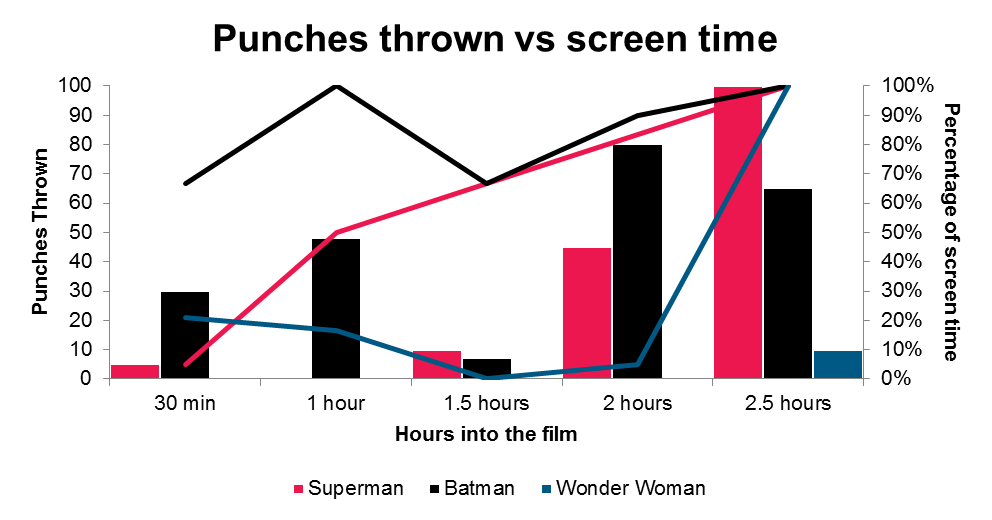
There is a lot of visual information in this chart – 3 datasets broken into two data series on two axes with different scales. You can stare at it for a minute and understand what’s going on, but it’s probably better to split it into two separate charts:

Or even better – transform the data so it tells the story for you:
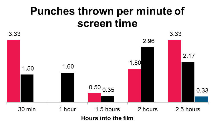
Now we can see that despite the titular character Superman showing up for only about 5% of the first 30 minutes of his film, he at least threw 3 1/3 punches per minute!
It’s important that whatever data visualization task is ahead of you, you make sure that your audience is focused on the story you want to tell and not just trying to figure out which bar goes with what number.
2. Add contextual information: Let your titles work for you
We might all agree that Batman v. Superman: Dawn of Justice is a terrible name for a major motion picture, but at least it tells you something! In this movie, you will see a court case between Batman and Superman, and you will see Justice dawn… (I kid – the name isn’t good). While it’s a bad movie title, we can learn something from it when visualizing data.
You tell me what tells a better story:
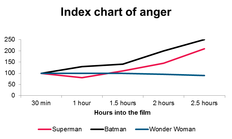
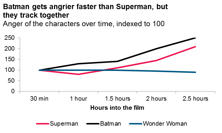
The data is exactly the same, but now there is added context. We’re able to leverage the chart title to A) give commentary, and B) explain precisely what the chart is showing. By adding the contextual information, the audience knows what they are supposed to take away from this data (namely, that Wonder Woman remains consistent throughout the movie, while Batman and Superman get super mad).
A descriptive title gives the reader context around what they’re seeing, and what they’re supposed to take away from the data visualization.
Say, what is an index chart? Onto my next point!
3. Create a compelling story by transforming your data
The chart above uses a method called indexing, which allows us to better compare changes over time, even when the comparisons are at a different base rate. To illustrate, here is the exact same data without the elements indexed:
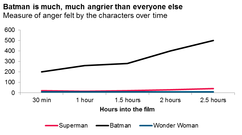
This chart, while containing the same data as the above indexed chart, tells us a completely different story. The visualization here demonstrates how much angrier Batman is than the other characters in the film, but it doesn’t tell you how their anger levels change due to the events in the movie. If the starting positions were closer, the graph might portray both things, but not all data comes with a common scale. Transforming the data – either with this technique or the myriads of others –can help you tell your story in a meaningful way.
4. Make your data pretty, because people respond to pretty things
As an analyst, I tend to be very comfortable with raw numbers. Usually, when I graph something, it’s only to see the shape of the data or explore a trend. So my graphs are ugly. They aren’t for the world to see (it’s like Batman v. Superman: Dawn of Justice is Zack Snyder’s internal graph, but he pasted it into a PowerPoint by accident).
When I do present data, though, I ensure that it’s as visually appealing as possible. There’s nothing that can invalidate your story like a shoddy Excel graph. Take a look at this beauty:
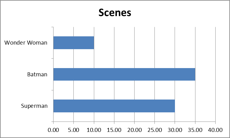
Everything about it screams amateur, from the auto-generated title, non-organized bars and weird spacing to the gridlines and outline. Plus, everyone recognizes that default “Excel blue” color.
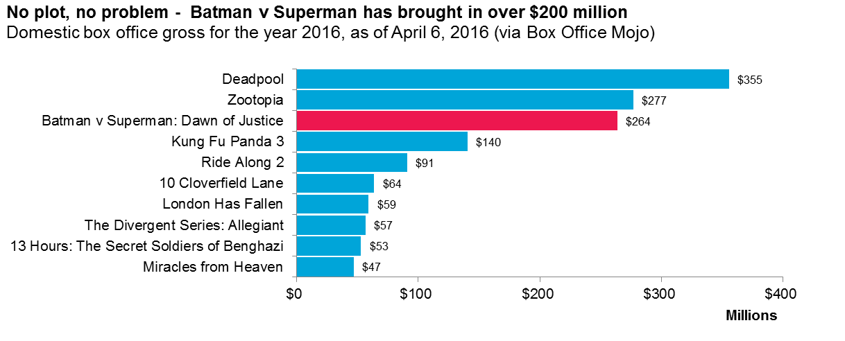
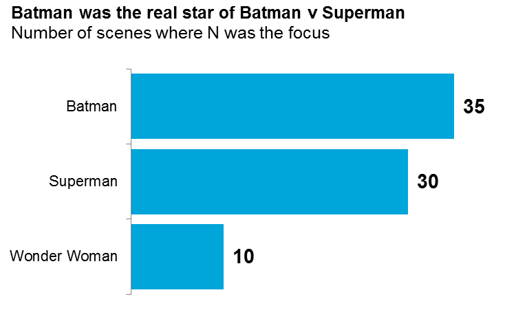
With a few small alterations, we can completely change the way the data is presented. Organizing the data in descending order, adding a title and context, adjusting the colors, removing the gridlines and axis (since the axis doesn’t really provide value here), adding data labels and fixing spaces are all fixes that help you tell your story with a more professional, visual display:
5. Show your data
Data is beautiful and scattered and sometimes random, and because of this, we tend to aggregate it to make sense of it. I’ll never outright object to this practice, but sometimes, it can be very powerful to show the spread of data. Take, for example, this scatterplot of injuries incurred while Batman, Superman, and Wonder Woman fought Doomsday in downtown Gotham (the property damage chart is just too much):
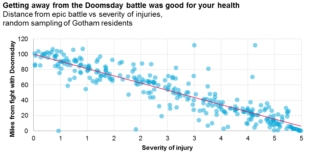
With the data plotted out, we can see a clear relationship between how far away a Gotham resident was from the action and how injured they became in the wanton destruction. And since both a nuclear weapon and lots of laser projectiles were used, the injury radius was quite wide. The spread of the data also shows us the outliers, which tend to be masked within (or even mislead the calculation of) an average or a summation of data. Plus, the chart is really pretty, so there’s that.
Showing the complete range of data isn’t always a good solution, but many times, the spread of the data can lend a wider angle on your narrative.
6. Pie charts are the devil (mostly)
I loathe pie charts. Outside of a few certain situations in which it narratively behooves you to show an overwhelming relationship (like the last time I used one), you’re better off visualizing data as a column or bar chart. If you need to show parts of a whole, then use a stacked version of either of those, and you’ll be in a better place.
Why might I hate pie charts? Mostly because, despite their ubiquity, pie charts are almost always uninformative. Humans have a lot of trouble judging angles (remember geometry?) and the central aspect of a pie chart is comparing the angle of one slice to another. Without that comparison, it becomes very difficult to relate to the breakdown of data. For example, let’s look at this relatively simple pie chart that breaks down the percentage of irrational actions taken by each character:
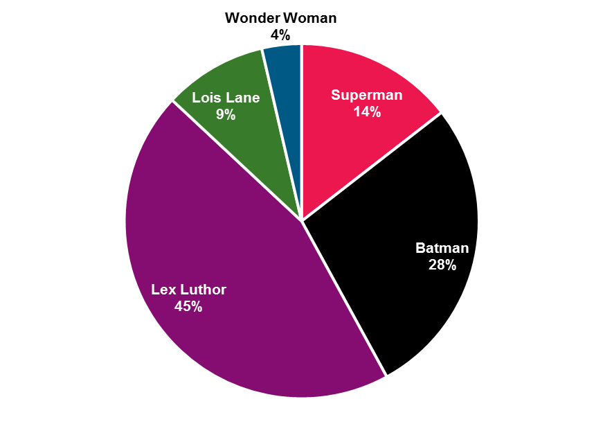
Even looking at this chart makes me angry. What’s the takeaway? That Lex Luther behaves most irrationally? That Wonder Woman behaves more rationally than Superman? It’s tough for even me to understand, and I made up the data!
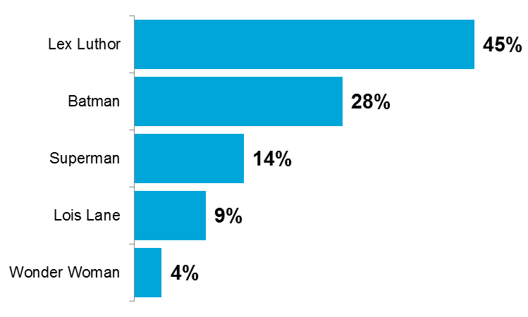
This can all be cleared up by visualizing the data differently. For example, as a bar chart:
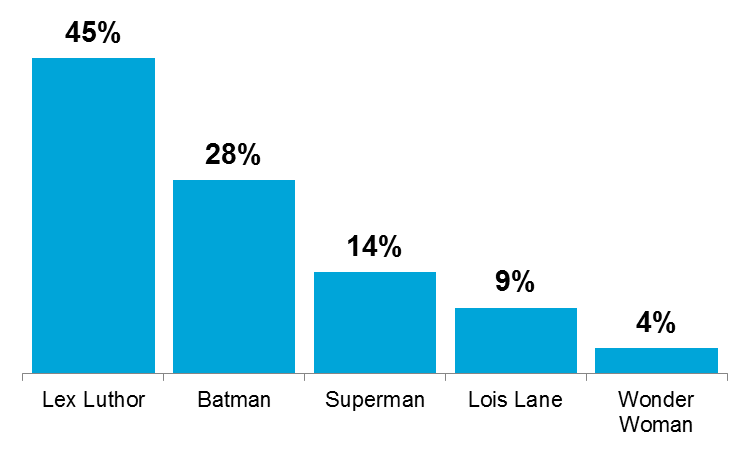
Or a column chart:
Or a multitude of other visualizations:
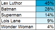
Pretty much any visual layout is more valuable to your narrative than your run-of-the-mill pie chart.
Data visualization is a powerful narrative device, and it’s becoming more important in a data rich world. Poor visualizations can harm a great narrative, while great visualization can empower a story that might otherwise be lacking (though one thing great visuals can’t do? Save Batman v. Superman: Dawn of Justice). But data visualization can only do so much – working with your data, transforming it, and understanding it are your first steps to finding your story and making it actionable. The visualization is just another tool to show it in an engaging way.
Here at Experian, we can help you create engaging, informative visuals for your data. We provide reports, analyses, and executive dashboards to hundreds of clients, making their data more actionable in the process. If you’d like to see some of our work, let your account team know.
And while I spent most of this post trashing Batman v. Superman: Dawn of Justice, I’ll leave you with one last visual:
