I recently spoke at the Future of Email event in New York, and since it was such a wonderful event (and I know all of you that didn’t attend are suffering great personal strife right now), I wanted to share a bit about our discussion.
This year’s event was dedicated to “reimagining the future of email” and featured great talks from Return Path, Fluent, and Liveclicker who focused on their role in rethinking common approaches to email. I, of course, talked about the ways in which we can reimagine the analytical revolution, and more importantly, your role within it.
It’s a common to think that the exponential growth in the analytical movement and the spread of its literacy is due to really smart, really nerdy people and tremendous advancements in technology. And it is! But only to a certain extent. Very smart people that design, interpret, and implement algorithms are as essential to the analytical revolution as an engine is to a car. But cars still need drivers (at least for the time being!) and that’s where you come in.
The data scientists, the algorithms, the data marts and Hadoop clusters – these are engines of the analytical revolution. Without them, we’d be unable to process the volume of data, predict the future, and harness the power of efficient algorithmic design. But they don’t lead the revolution – they execute it. The drivers of the analytical revolution are not the nerds, but the people that need the answers. They are people like you.
So how do you begin piloting your teams into the future? The full answer is far too complex to discuss in a blog post, but here are the three subtle things need to think about to get started.
1.) Move beyond reporting
Reports are great. Reports are ubiquitous. Reports are not enough.
You cannot forget this. Too often, we stop at a report and assume we have an insight. Maybe that’s the case, but more often than not, what we believe to be an insight is in reality just a flag that we should go looking deeper. Take the chart on the right. We’re looking at a standard trend chart; in this case, it’s measuring total transactions by day. This is typical of a report, and examining it gives us a few pieces of information – overall trend direction, seasonality, and “good days.” If the trend took a sharp southward dive, it might tell us something is wrong. But beyond those elements – the “monitoring” aspect, that’s about all the insight we can gather.
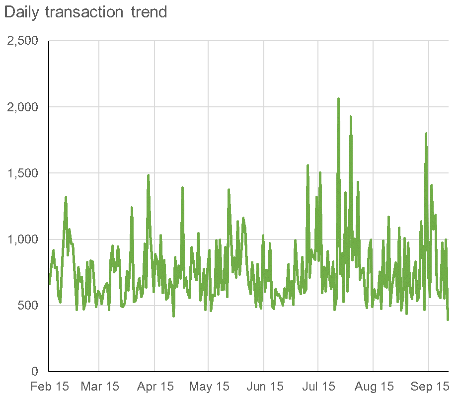
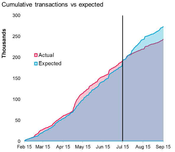
Now let’s look at the chart below it: here, we’re taking the exact same data, but transforming it into a cumulative view. And against that (in blue), we’re charting the expected number of cumulative transactions that were produced using a time-series expectation model. Now look at the insight! We can see that up until July 2015, the brand was beating long term modelled expectations, and then suddenly, the underperformance began. Most surprising is that the underperformance occurred almost exactly at the time the above chart shows a spike. So looking at traditional reporting makes it appear that performance was positive, when in fact, those spikes “should” have been higher! The underperformance also gives us a clear place to examine results more fully…and in this actual example, we determined that the date corresponded with a site refresh that broke a tracking pixel! Reporting couldn’t provide us that insight because it lacked context. A fairly basic analysis helps to determine not only performance versus expectation, but uncovered a data quality issue that may have persisted for years.
Making the conscious effort to not just rely on reporting – and to look beyond it for true insight – is the first step in driving your organizations analytical revolution.
2.) Challenge the status quo & the conventional wisdom
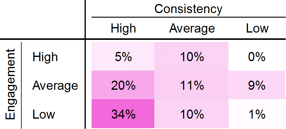
Have you ever examined the KPIs you measure and really explored why you use them? Do they tell you what you believe they tell you? Without thoroughly challenging what you’re currently doing or what the industry says you should do, you might be missing valuable insight and you might not be unleashing the power of your analytical teams. Let’s look at the following table to illustrate this point.

Based on the above table, it wouldn’t be unreasonable to assume that the three groups are similar to one another and to the US population. But looking at a basic histogram shows just how poor a decision it would be to treat the groups the same.
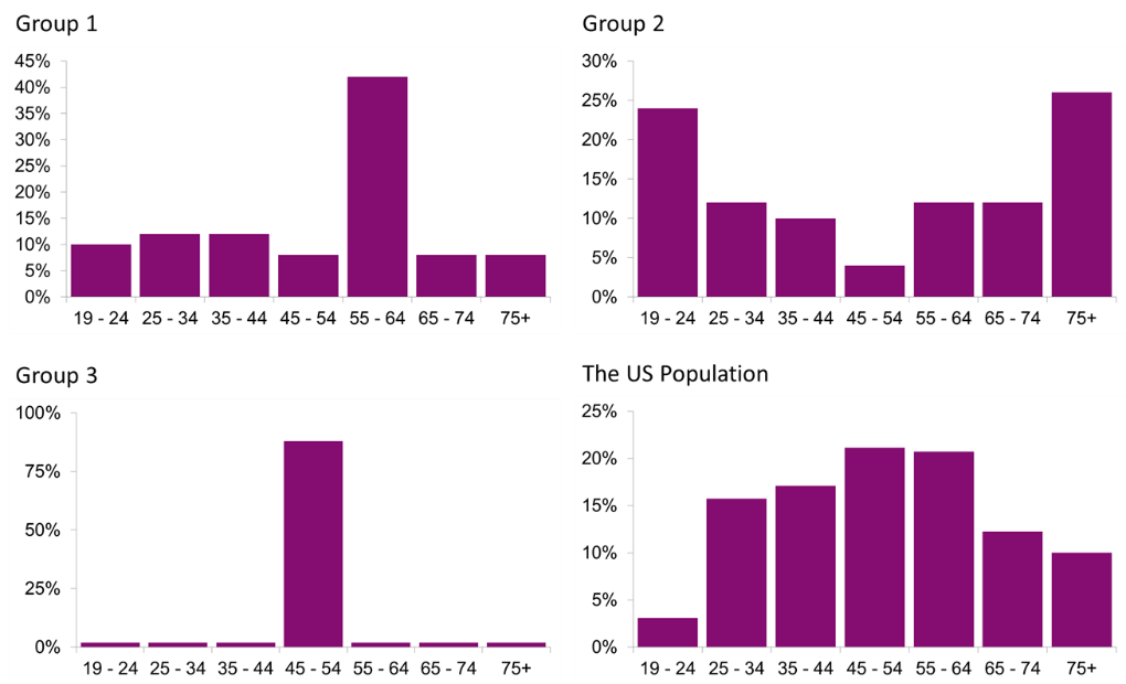
Challenging an analyst that tends towards averages versus distributions is just one way you might drive a level of (obvious) insight that may have otherwise fallen through the cracks.
Probing conventional wisdom is another way to drive your analytics forward. For example, let’s examine click to open rate, a KPI that is often used as the measure for an email’s engagement. First, let’s examine the math of our favorite email KPIs
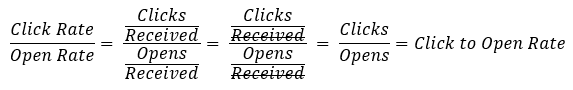
Notice anything peculiar? Doesn’t it seem like there’s a lot of overlap? Based on the above equations, we can actually take a few arithmetic steps to hone in on some major problems with the click to open rate KPI:
So basic arithmetic shows us that click to open rate is actually comprised of – and therefore, extremely susceptible to influences from – two other rate KPIs. Thus, the metric itself doesn’t actually do a good job of measuring engagement. Organizations that use it as a primary KPI must think hard about what it’s actually measuring and whether that’s an important evaluation tool.
3.) Engineer the data for more information
I am a big believe in a concept called feature engineering. Generally speaking, feature engineering is a machine learning application that describes the process of deriving “features” or variables that provide more information than the raw variable itself through selection, transformation and manipulation. While the concept is both broad, informal, and difficult, it’s importance cannot be overstated for those that desire to drive an analytical revolution in their own business.
Too often, we either rely on the data we have on hand as the only valuable source of insight, or we stop our efforts to derive more information from the data at the basics (everyone does some feature engineering already – how else would you get an open rate?!). And while I don’t expect many readers to perform the task themselves, being ready and willing to challenge your analysts to derive more information from the same KPIs is essential.
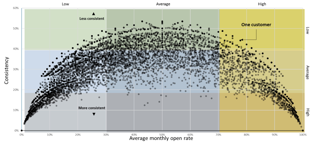
Let me highlight the concept with a basic example. Assume we have only two variables on our customers: open rate and time. What can we gather from this data? Traditional thinking would tell us things like open rate trends, percentage of the population that has x% open rate versus y% open rate, the time on the file, and maybe open frequency. But with some basic transformation and a little bit of math, we can add an entirely new, quantifiable metric – consistency. First, we take each customers open rates, and we partition them into months. So customer N had an open rate of X, Y, Z% in three months. From there, we can take the standard deviation of the monthly open rates by customer, and then add their weighted open rate for a new way to classify our customers – both in terms of overall engagement and consistency of engagement. These two variables together provide a huge leap in information about our customers beyond just one or the other. After all, a customer that opens 100% of emails the first two months and then doesn’t open for 3 consecutive months might have the average open rate as someone who opens 40% of emails each and every month, but they clearly aren’t behaving the same way. Plus visualizing data on two scales can be dope! Below you’ll see 10,000 individual customers visualized for engagement level vs consistency (the more consistently you engage, the lower your standard deviation, and therefore the lower on the graph you’d be)
I’m not suggesting each one of you run this exact exercise, or even think about formal feature engineering. But knowing that more information is hidden in the data you already have can get you on the right track to challenge your analysts to figure out ways to unearth it. After all, the archeologists aren’t always the ones that dig up the bones.
In conclusion
The analytical revolution is real…and it’s more reliant on you than you think. By remembering these three subtle suggestions, you’ll be on your way to reimaging analytics in your own organization and driving your business further. The work won’t stop with this blog post, but it’s a good start.
You can also continue your journey into better analysis by joining me at our 2017 Client Summit in Las Vegas, where I and members of my team will be hosting sessions that help redefine and reimagine perspectives on analysis. I hope to see you there.